

We’ve all seen it, I see it every day and stare, absent-minded, at it for roughly two hours as I travel to and from work on a variety of lines. To me it goes hand-in-hand with ‘please mind the gap’ and ‘stand clear of the doors’, but to a newcomer it is an aid to getting around the world’s second largest megacity.
It has inspired other underground (or subway) maps the world over and has been parodied globally to give the lines new significance – from a Biblical tube map to what each tube station tastes like, put together by a man with synaesthesia.

The Biblical Underground

‘Tastes of the Underground’
It’s a map of London, albeit a non-geographically accurate one, which is symbolic of more than just train lines, but has become an icon of the capital and an inspirational piece of design. But why has it been so successful? How has it become this icon of our capital city and why is it so highly merchandised – why don’t we want iPhone cases and pillowcase covers with local bus routes printed on them?
In March 2013 the creator of the tube map, Harry Beck, was honoured with a blue plaque which commemorated the 80th anniversary of the map’s birth in the year of the 150th anniversary of the London Underground.
However, Harry Beck wasn’t a big-shot designer working for TfL, but was originally employed to draw electrical circuits for the Underground and, in his spare time, sketched out a diagram to replace the haphazard and complicated map that Londoners used at the time for want of something better
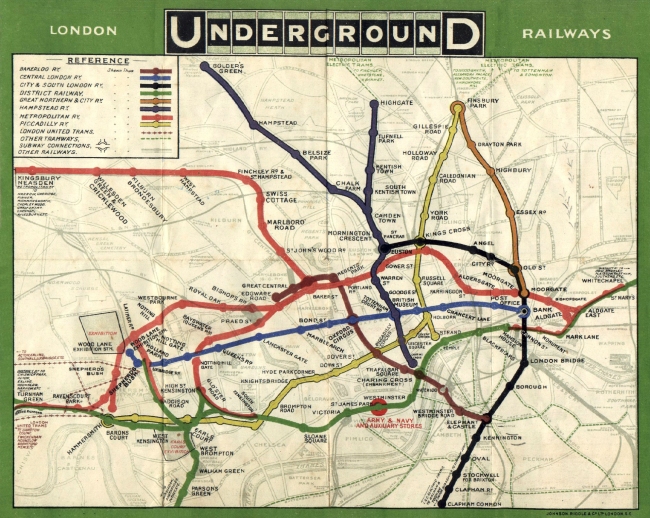
The tube map before Beck

Beck’s tube map
A map, by definition, is a representation of the features of an area of the earth, showing them in their respective forms, sizes and relationships. However the tube map, for all it’s simplicity and accessibility, is not geographically correct; as this is the premise for a map then there must be a deeper explanation as to the success of such a diagrammatic and geographically inefficient ‘map’.
Map designer, Aris Venetikidis, gives us a possible explanation as to why we have such a love for those inaccurate coloured lines. When we move to a new environment we start to build a cognitive map in our brains of where we are – as we spend longer in the environment, this map expands until, eventually, you know your way around. In order to do this, you construct linear routes linking point A to point B – our mind constructs these straight lines and generally a route coming off that first line will be at a 90 degree angle. We attach meanings and emotions to the things we find along these lines and fill our cognitive maps with markers of meaning. Imagine for a moment that you are drawing a quick map for a friend, you are likely to use straight lines and corners but it is highly unlikely that it would be a geographically correct representation if you laid an OS map over it.
Explaining this unlocks the secret to the success of Harry Beck’s map; although he didn’t realize it at the time, he was creating a map which correlated to the language of our brains and how we would create a simple map of our environment. Aris Venetikidis therefore attributes Beck’s success to three things:
- the omission of less important information
- extreme simplification
- extreme geographic distortions
(Aris’ TED talk can be seen in full at http://www.ted.com/talks/aris_venetikidis_making_sense_of_maps.html)
There are many who argue that geographic distortion is detrimental to both Londoners and tourists in terms of creating a sustainable way of getting to know your environment. The misrepresentation of the distances between stations causes confusion and unnecessary travel – for example between Covent Garden and Leicester Square which is a three minute walk. Another example is the route between Chancery Lane and Farringdon Station; on the tube this would require two changes and four stations yet it is a seven minute walk between the two.

The ‘Walk Map’
‘Legible London’ is a system which encourages and helps those in the capital to find their way around by walking. They describe themselves as ‘giving people the confidence to get lost’ (Patricia Brown, Chief Executive of the Central London Partnership) and make the point that ‘109 journeys between Central London Underground stations are actually quicker on foot than the Tube’ (http://www.tfl.gov.uk/microsites/legible-london/3.aspx). With this in mind the Central London Partnership created a visual language and consistent mapping system which encourages people to walk around London and to remedy the fact that Beck’s tube map may have skewed people’s perceptions of where things are. The CLP also developed terminology which tapped into the phychological idea of cognitive mapping in order to implement their scheme. During research they identified specific areas of London which they termed as ‘villages’; these were areas such as Leicester Square, Covent Garden and Knightsbridge, areas with commonly used names which can help pedestrians to quickly relate one part of London to another. Within these villages they further identified ‘neighbourhoods’, for example within Covent Garden lie the neighbourhoods of Seven Dials, Neals Yard and Long Acre, with the intention that as the pedestrian becomes more familiar with the area, the more they will subdivide it into smaller, linked pieces, building a more detailed mental map.

Legible London
Despite the drive for people to really get to know their surroundings and walk around the city rather than use public transport, Beck’s tube map remains an iconic design which is immediately recogisable globally and has visibly influenced other transit designs, for example the Moscow and San Francisco subway maps

Moscow’s diagrammatic subway system

San Francisco’s subway system
Beck’s design is an extreme simplification of an overcluttered system which has made navigating the warren of the underground possible both for Londoners and newcomers to the city. The oversimplification prompts the language of wayfinding in the brain and explains that virtually all perception is about simplification, omission and compression; The success of a non-geographically correct map such as Beck’s is that the mental map we build is not strictly geographic but revolves around the relationship between relevant and memorable locations and routes between them.
