The science of creativity

I’m bringing a slightly different post this week after watching an incredible documentary on how creativity is generated in the brain.

Available on BBC iPlayer until Thursday (and I’m sure you’ll be able to find it somewhere online after that), Horizon’s: new episode, ‘The Creative Brain: How Insight Works’ is pretty scientific but also comprehendible to the creative mind. In fact it’s interesting on more than one level because it goes beyond artistic creativity to explore how scientific creativity has shaped the human race.

The documentary focuses on three main channels of research

  1. How insights work
  2. Divergent thinking
  3. The science of improvisation

We’ve all heard of the ‘aha!’ moment, that flash of inspiration that seemingly comes from no-where and provides an ideal solution to a problem that we’re facing. Do you ever wonder if there’s more to it than that? Is the flash of an insight more than just a random thought? I suppose I’ve always known there was a science behind it but never really considered this fact in too much detail. The truth is that over the past decade there has been a boom of interest and research in the whether the creative ‘spark’ can be explained. A subject that was previously considered too ‘elusive’ or subjective can now be observed and explored through more than watching a person’s exterior reactions; the development of advanced neuroscience equipment has opened up a whole new avenue for us to gain a better understanding of what really makes us creatives tick.

So back to the documentary. The first guy who they look at is a man called Jonathan Schooler who states that ‘the development of humanity is based on creative innovation’.
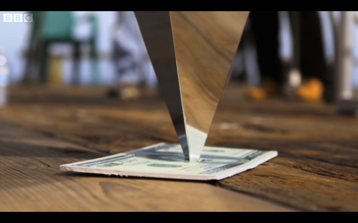
In order to try to establish where an insight comes from he set up an experiment where a metal pyramid is balanced upside down on top of a $100 bill; the challenge is to remove the bill without toppling the pyramid.

Impossible? Not when the answer is revealed to you within a set of clues. But will you be able to process the words to understand what could be the answer?

Confused? So was I.

Breaking it down simply, an iPad with the clues on was placed on the left of an image – when done like this, the observer still couldn’t come up with the answer, even though it had been within a select group of words put in front of them. This is because they were using the left side of the brain to work it out. ImageHowever when this was reversed, they were able to see the answer fairly promptly. The answer, in case you’re wondering, is to burn the note.
So the conclusion from that piece of research was that the right hand side of the brain is more likely to make the connection leading to that coveted ‘flash’ of insight.

Our next guy, Mark Beeman, is a pioneer of neuroscience and his research aims to uncover the neural correlate of creativity – in English, that’s what interacts to form the insight within the brain. He set up a test where he would measure a person’s brain activity while giving them three words and asking them to think of a word that would work with all three.

For example, the three words are ‘pine’, ‘wood’ and ‘sauce’.
The words that goes with all of these is ‘apple’ (it’s all very 11+/verbal reasoning isn’t it?)

Once the test subject has thought of the answer, they then say whether they came to the answer through analytical means (testing out word after word to see if they fit) or through insight (a seemingly instantaneous answer). Beeman then compared the brain waves to come to his conclusions – this next bit is a bit science-y but stay with me.
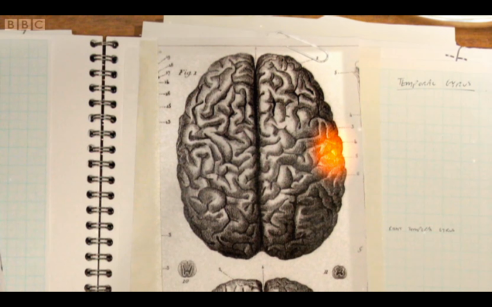
Insight occurs in the anterior superior temporal gyrus, we have one of these on each side of the brain but when an insight occurred it showed a burst of gamma rays on the right hand one.

Image

The reason for this is that on the right hand side of the brain, the neurons branch out more broadly than on the left, and this means that they are able to find more connections.

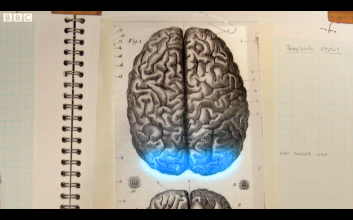
John Kounious, another scientist, pushed Beeman’s theory further by finding that about one second before insight occurs and the gamma rays are released, a burst of alpha waves are released from the back of the brain.

Image

Alpha rays reflect areas of the brain shutting down and so this burst, before the insight, allows something resembling a ‘brain blink’ to occur, momentarily shutting down the visual cortex so a faint idea is allowed to rise to the surface of our consciousness as an insight. Interesting isn’t it?

It’s like when you ask someone a difficult question, they will inevitably look away from your face because a face is a distraction, they will be drawn to look at the area of least distraction so their brain can concentrate. This is what your brain helps you to do subconsciously.

 The next channel of research explored is divergent thinking. This simply means a way of thinking that ‘diverges from known ideas and comes up with something novel’ and it is tested in the simplest of ways.

A person is presented with a brick and told they have a minute to come up with as many different uses for it as they can. They are then scored from 1 (unoriginal and predictable) to 5 (highly original) and the higher score you get, the more of a divergent thinker you are.

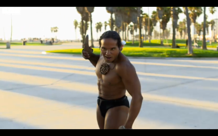
Rex Jung tested several people on Venice Beach, California, a well known spot for eccentrics and creative thinkers like this guy:

Image

Your guess is as good as mine as to how this demonstrates the use of a brick… Anyway, Rex’s idea was that intelligence and creativity may not be as closely linked as previously thought.

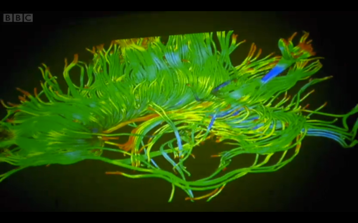
He brings in some beautiful images of white matter for us to look at; in case you aren’t aware of what this is, it’s the wiring in our brains that connects different regions and we all have 150,000km of it stored up there!

Image

Rex explains how, with intelligence, more white matter = higher intelligence. His theory is that the opposite is true for creativity. Why? Because, ironically, it gives us the ‘head-space’ to generate ideas (see where the saying comes from?). Where intelligence is measured from how fast an idea can get from A to B, creativity is more of a meandering, less travelled road which is the neurological basis to divergent thinking.

Back in Baltimore a man called Charles Lim is relaxing in a Jazz café after work, this is his favourite place to hang out as he is fascinated by the way in which they improvise their music. Keen to find out more, he places musician Mike Pope in an MRI scanner with a keyboard on his lap, plays him a melody and asks him to improvise with his own keyboard.

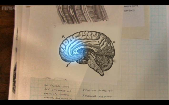
The results showed changes in the pre-frontal cortex of his brain, an area that acts in conscious self-monitoring, basically making your focus on whether what you’re saying and how you’re acting is ‘right’ in a situation. The decrease shown is what Lim likes to describe as proof of people ‘taking a risk musically’ and interestingly could be linked to great poets such as Coleridge who were well known for their use of opiates while writing great masterpieces of poetry.

Image

There’s a lot more I could write about but I think I’ll let you watch the documentary yourselves to see the rest of the tests. Personally as a creative (and not a scientist) I found it really interesting to see the basis to something that I often consider to be spontaneous and, let’s face it, a little bit magic. Who doesn’t know the panic of a creative block a week before the deadline and the relief of that miraculous insight that you’ve been searching for?

And before I forget, here’s the link:
http://www.bbc.co.uk/iplayer/episode/b01rbynt/Horizon_20132014_The_Creative_Brain_How_Insight_Works/

Will you ‘Do The Green Thing’ for Earth Hour?

Have you ever thought about raising awareness for climate change through creativity? Do The Green Thing have.

If you’ve never heard of them, Do The Green Thing is a charity focused on the environment that inspires people to live more sustainably through creativity. They claim to have reached over 11 million people in over 200 countries and estimate that those who subscribe to them save over twice as much CO2 as they would have otherwise.

Do The Green Thing are currently running a campaign to support WWF’s Earth Hour through the creation of 23 posters designed by big names in the creative industry. From 1st of March until 23rd March (the day on which Earth Hour takes place between 8.30 and 9.30pm), a poster a day will be uploaded to their site (http://dothegreenthing.tumblr.com).

According to the charity, the posters will inspire people “to take simple green actions at home, school and work” through getting to places without a car, using less electricity and consuming less meat. These sustainable actions have been chosen by the nine environmental advisors of the charity and are executed by some of the industry’s top creatives.

Having read all this (if you have read this far), I bet you want to see what the fuss is all about… Here are some of my favourites so far, although there are still thirteen more posters to go so keep your eye on the blog!

Image

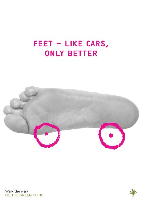
Marina Willer, a partner at Pentagram design, created the second in the series with a photo of her own foot encouraging people to walk rather than drive. She claims that walking two miles a day rather than driving would save over 300kg of CO2 each year, and burn a tidy 73,200 calories (so you can focus on that if you’re not too bothered)

Her view on her piece is that “We can panic about where the car keys are, get grumpy in a traffic jam, run out of petrol before we find a parking space, have a fight with the pay machine, and get a congestion charge penalty to finish off. Or we can walk and enjoy the world.”
Personally I like to feel like I’m doing something to help the environment but at the end of the day if it’s raining and I need to get somewhere I’m most likely to choose the comfort of the car. I like the way Marina puts this though, parking spaces can be a nightmare, not to mention always having to have change for the ticket; and what about getting in and out of the parking space when some moron has parked too close? Going back to the design, I love how simple this poster is; yet it’s simple enough to be memorable.

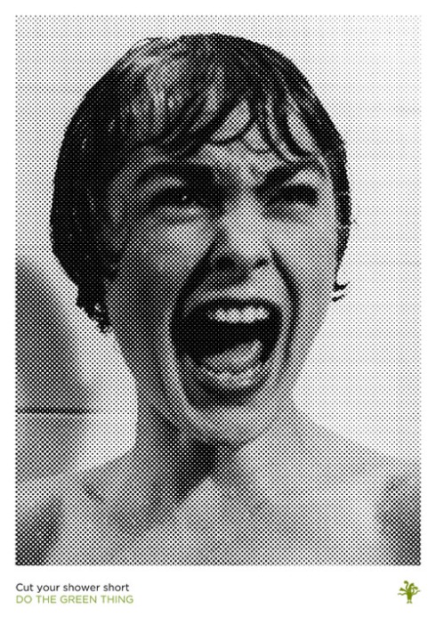
ImageThe fourth installment in this series comes from another partner at Pentagram, Michael Bierut, who decided to scare people into making their shower that tiny bit snappier (If you’re not familiar with the reference, Bierut is pointing to the shower scene in Psycho, an iconic moment in movie history).

Here’s what he had to say on his work:
“Taking a brisk, water-efficient shower is the best way to start a productive day. And the most famous shower ever filmed was one that was notoriously interrupted. Had Janet Leigh been a bit quicker, she may have made it to the end of the movie!”

Just think about it, cutting your morning shower two minutes short will cut down your water use by 16,425 litres and if that doesn’t cut it, just think of the extra two minutes in bed.
And if you’re still not convinced, you can download Do The Green Thing’s ‘showercast’ here: http://www.dothegreenthing.com/content/short_sharp_showercast

Image

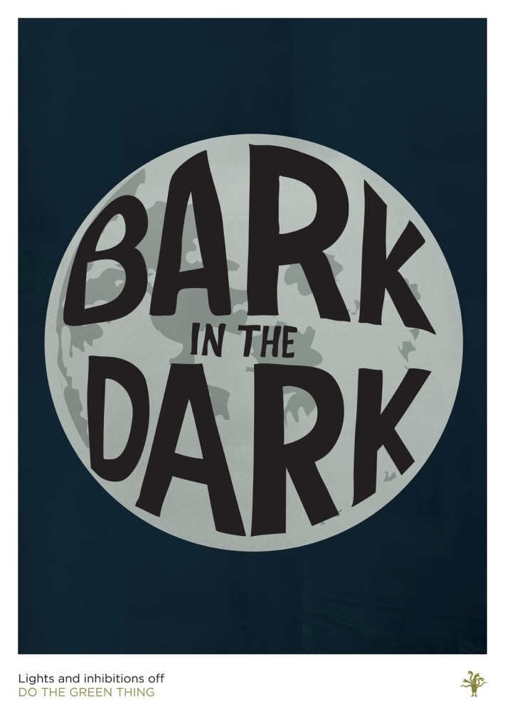
London based designer and director, Steven Qua, was commissioned to create the tenth poster, released today, to encourage people to save electricity and free their minds… interesting.
I’ll be honest, I had no idea what this was about until I read his explanation:
“When I was young I lived in a town with a lot of dogs, I used to lie in bed at night looking at the moon, listening to the barking. Now I’ve moved away I miss the barking in the dark. Every day I turn the lights off look at the moon and bark myself to sleep.”
Taking a less generic approach to the brief, Qua has brought us a personal memory and experience but with the added incentive to save 20% on your electricity bill. As for barking myself to sleep… well I suppose you should try everything once.

That’s the end of my spiel on a few of the posters so far, but you can see all of them (with the full explanations) on http://dothegreenthing.tumblr.com.
To find out more about Earth Hour, the reason behind this campaign, visit http://earthhour.wwf.org.uk.

Is going too far the new ‘thing’

After my post a few weeks ago about Nivea’s ‘Stress Test’ campaign, I thought it would be interesting to show you this:

The upcoming release of a neo-noir film named ‘Dead Man Down’, a thriller/crime production by Niels Arden Opley, prompted marketing agency Thinkmodo to pull this rather morbid stunt.
In true 21st century style this New York-based agency decided to hide a camera inside and elevator and stage a murder attempt and then film people’s reactions when the elevator doors open.

The reactions are mixed – some run away, some try to stop the assailant and one simply stands there and takes a photo on his phone (whether or not he intended to use this later as evidence is unclear).

As I asked before when I wrote about Nivea’s campaign… how would you react?

‘Easy’ Money – Feminists look away now

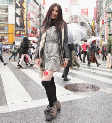
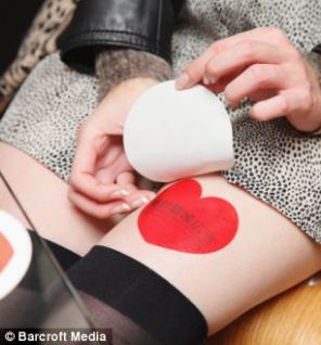
What is the weirdest platform for advertising that you’ve ever come across? One of the first ‘design’ books I bought was ‘Creative Advertising’, by Mario Pricken, and it is still one of my favourite to thumb through when I’m struggling for ideas and need some inspiration. Within its pages you’ll find groundbreaking ideas for the placement and implementation of advertising campaigns; however there is one, more recent technique, that wouldn’t be out of place in here. This week a new Japanese marketing technique has come to light in which women are given the opportunity to rent their legs out as advertising space.

Image

Now we all know that space in Japan is extremely valuable – with most of the country being mountainous, every area that can be transformed to an urban area has been and the affluence of the country means the cities are Japan’s hotspots. Buildings must be developed up rather than out and the Japanese are the leaders in making the most out of a small space. One brilliant example is this man who turned his 334ft apartment into 24 rooms through clever ways to change the spaces (see the video at http://www.youtube.com/watch?v=f-iFJ3ncIDo).
So the clever people at Absolute Territory PR have developed and implemented the idea of hiring out body parts as a new, innovative place to advertise products and services. If you can read Japanese or work out how to translate the page, you can check out Absolute Territory at http://www.zettaipr.com/.

When considering ad placement, one has to consider how much exposure the ad is going to get – how many people are going to walk past, how many people are going to notice it and, of course, will the advertising platform be enough to make it memorable? Ambient advertising (advertising in the environment) is clearly much more interesting than a print ad on a billboard and ads that move around make the viewer subconsciously work harder to see it and glean all the information that the advertisement offers.
Absolute Territory have found a potentially controversial place to advertise, a place where they think a lot of people will be looking, and they may well be right!

Image

Giving companies a ‘leg-up’ on their competitors, advertising on the legs of young Japanese girls is a unique idea working from the idea that ‘sex sells’. However distasteful the idea may be, something a little bit risqué and naughty will attract people’s attention and be memorable, so maybe Absolute Territory are onto something; this strategy is reported to already be popular with Tokyo businesses and I’m going to guess more male orientated companies will be at the front of the queue to sign up.

The criteria for those interested in earning some extra money by attracting attention to a label on their legs is that they must be over 18 years old and be connected to ‘at least more than 20 people on some social network’.

The work sounds easy enough, a girl who is employed in this way will have the ad ‘stamped on their leg’ and then left to get on with their day. To be paid they must wear the ad for at least eight hours a day, and it is recommended that they dress in high socks and a miniskirt, for maximum attention to be drawn to the legs and, of course, the advert (although this is probably the secondary thing that people will notice).  Proof must be provided of advertising through posting photos of them ‘at work’ onto social networking sites such as Facebook and Twitter. It has been reported that around 1,300 girls are already registered to use their legs as ad space already, so is it just another easy way to earn some extra cash?

Image

Is this ethical practice though? On one side, this really is no different to a club promoting girls to stand around town or outside the club on a night out, wearing hotpants and a crop top emblazoned with the name of the establishment; the only difference is they are not advertising on their bare flesh. But those girls are still being paid to dress provocatively in order to attract customers, which is what Absolute Territory ask their girls to do in order to maximise exposure. But then dancers in clubs and, if we’re taking it to the extreme, prostitutes are also paid to sell their bodies in other ways, so where is the line? Models are also, to a lesser extent, paid for their bodies, although their advertising of clothes is focused on how the clothes are designed and hang from the body rather than the body being the first thing a person would notice.

What about looking at this from a feminist point of view? These girls are being paid to present their body as a thing to be looked at, a thing to provoke desire, even if it is for a product rather than the girl themselves. It’s clearly flattering to be desired but are these girls degrading themselves by presenting themselves as no more than a moving billboard?

On a lighter note, I’m not sure how Japanese advertising usually looks, but these advertisements on the girls’ legs often don’t seem obvious as to what they are. For example, if I walked past one of these girls in Leeds, I would probably assume that it was a tattoo rather than a ‘well-placed’ advertisement. Having said that though, I am a girl and wouldn’t pay too much attention to a scantily clad girl with an unsubtle tattoo on her upper thigh.

What do you think: Clever marketing or just another way to objectify young women?

How to give someone a mental breakdown, by NIVEA

What do you think of when someone says the word ‘Nivea’? Coming from the Latin word niveus/nivea/niveum, it literally means ‘snow-white’ and, doubtless, you would think of their calm and sensitively marketed skin-care products. Or you would have until now…

Nivea has just launched a new Stress Protect deodorant, and to market this new product, Felix and Lamberti advertising agency decided to employ the age-old technique of Schadenfreude – when pleasure is derived from the misfortune of others.

The appropriate way, Nivea decided, would be to literally stress out their target market to make a point. In a German airport, they targeted particular passengers in ‘the Stress Test’ by taking a sneaky photo and producing fake newspapers which labelled the passenger as a wanted suspect. They then place someone, with said newspaper, in plain view of the ‘suspect’ and wait for a reaction. Once they have this initial reaction, Nivea push it further by broadcasting an announcement describing the ‘suspect’s’ appearance and follow it up with a television broadcast on the airport screens.

So the ‘suspect’ is now being pointed at, people are moving away from them and muttering under their breath and they themselves are clearly on the edge of panicking, if they aren’t already. At this point, two security guards appear with a metal suitcase and walk up to the ‘suspect’ asking them whether they are stressed.
I’m not even joking when I say that watching the campaign video, I was stressed on behalf of this poor person, so I can’t even imagine how I would feel in their situation. I am pretty sure I would be having a full on breakdown at the point where everyone is looking at me as if I’ve killed someone and the embarrassment of being singled out, even once the metal suitcase is opened and the ‘suspect’ is presented with a Nivea Stress Protect deodorant, would be pretty intense.

There is a ‘happy ending’ to each person’s ordeal but the prank is played so well by all those around that, if I was in that position, I would not suspect it was a joke. In terms of marketing, this campaign is memorable and amusing… to an extent, once the tension has been relieved and the ‘suspect’ realises they haven’t actually done anything wrong.
Nivea’s prime aim is to drive the concept of their new product into the target market and allegedly checked with the friends of the ‘suspects’ to see whether “a brief moment of stress would be a problem’ for him/her. But, at the end of the day, not many of my friends have seen me under intense stress and I definitely wouldn’t be impressed if they’d put me in this situation. Although I can think of some friends who would react in a pretty funny way to something like this, I can almost guarantee that they wouldn’t thank me for putting them in that moment of shock and tension where you are being accused of god-knows-what in front of god knows how many people.

What do you think of Nivea’s ‘big prank’/ brand new marketing campaign? How would you react if you were put in this situation? I’m happy enough having a nervous laugh hundreds of miles away from the airport but, as a target of such a campaign…? I’m not so sure.

Time spent that otherwise might be forgotten

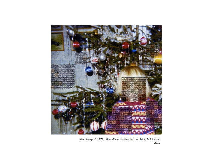
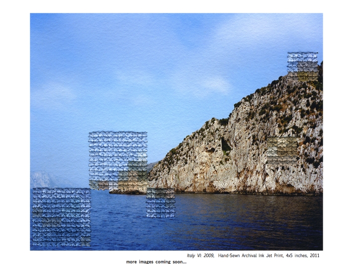
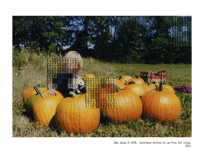
Is the title of a piece of textiles/photography work that I came across the other day, by artist Diane Meyer. On her website (http://www.dianemeyer.net) she says of this particular series:

‘This series is based on photographs taken at various points in my life and arranged by location. Sections of the images have been obscured through a layer of embroidered pixels sewn directly into the photograph. The embroidery deteriorates sections of the original photograph forming a new pixelated  layer of the original scene. The project refers to the failures of photography in preserving experience and personal history as well as the means by which photographs become nostalgic objects that obscure objective understandings of the past.’

Image

Image

Image

There were two things that struck me about this project:

  1. My personal interpretation
    I hold an interest in psychology and this project really made me think about her mention that photographs can ‘obscure objective understandings of the past’. My family is a big collector and creator of photo albums and, as a child, I used to love looking at the photos of when I was a baby or a toddler and asking who people were, what we were doing and where we were in those photos. The answers gave me a picture in my head that I held onto and, when looking back at the photographs years later, that picture came back to me and I started to think that I could actually remember when it was taken because the details had been relayed to me so many times in the past. 
    I’m not entirely sure of the science behind it but I think it is widely agreed that not many of us remember events before we are over the age of three so I started remembering times in my life that I would look at a photograph and think ‘I remember that’, when really all I remember is being told the details at some point. 
    As a young child (between the ages of one and two) I lived in Sierra Leone while my father was working as an ophthalmologist in Freetown, there are a few albums taken while we were out there and there is one photo that I remember specifically and that is of me helping our housekeeper, Moses, to do the laundry in a big red tub outside. 
    I have seen that photo so many times and asked so many questions about it that I feel like I can remember being there, when the reality is that I can’t; if my parents mentioned another event that hadn’t been recorded through the camera lens but happened around the same time, I would have no idea what they were talking about. Anyway, I’m definitely rambling on now so I will leave it at that.
  2. The contrast between the two mediums
    This caught my eye because of how the outcomes appear at first glance or if seen from a distance. The beauty of them, for me, is that your brain automatically fills in the pixelated/ embroidered gaps so that you can make sense of the photograph without having to see it in great detail to begin with.

JCDB x

Keeping Britain British!

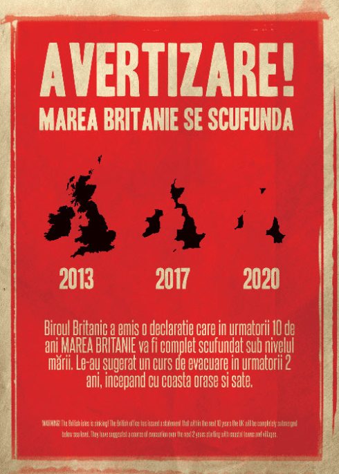
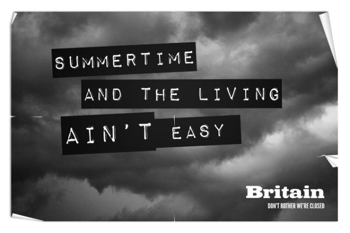
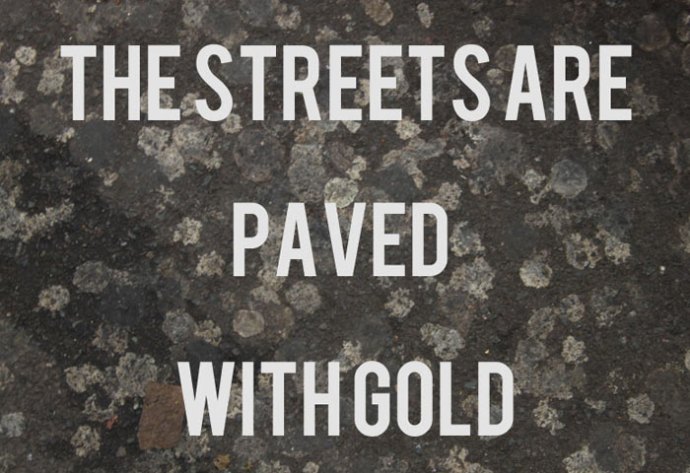
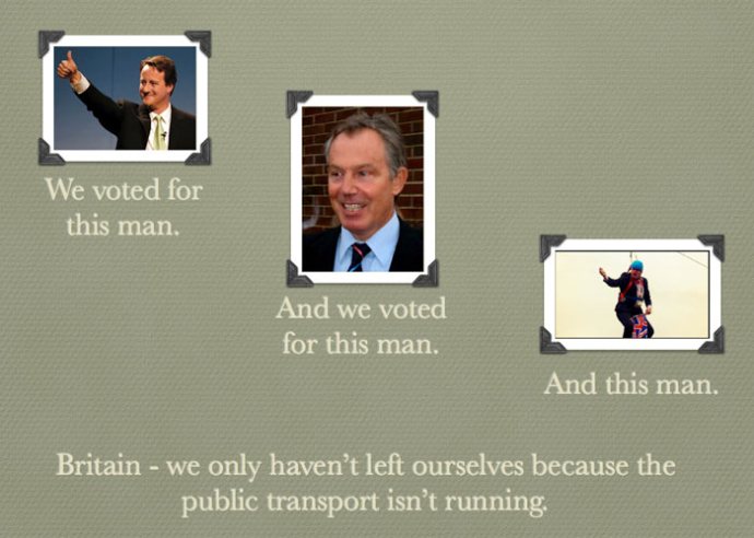
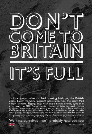
This morning I saw an article on the Guardian website responding to a claim that the UK Government has been considering the use of an ad campaign to deter immigrants from coming to the UK (http://www.guardian.co.uk/uk/2013/jan/27/uk-immigration-romania-bulgaria-ministers); the paper then asked for creative suggestions for what readers thought would put people off moving to our country. With so many advantages to living in the UK (more benefit money than you’d earn on a minimum wage, the NHS, menial jobs that we lazy Brits won’t stoop to etc etc), many people have highlighted the most commonly complained about aspects of our society, with comical results.

Before you see the images, I would first like to say that I am not posting these as an example of good design as they’re definitely not as polished or well put together as the work I am expected to produce on my course – instead I am highlighting the clever copywriting.

Image

Despite being in a different language, Matt Murphy describes his piece being ‘self explanatory’. The poster implies that Britain is sinking, whether under the weight of the people in it or because of the rain, no-one wants to come to a country where being underwater is a standard. Design-wise, this is my favourite due to fairly even typesetting and layout and simple graphics, it is also reminiscent of crisis posters which would attract people to help the country, but not necessarily to visit it.

ImageAn interesting way of provoking sympathy for us Brits through the prevalance of rubbish on our streets. Where I live (a student street in all fairness) there is rubbish everywhere, on the pavements, in the road, even by our front door when people decide to throw rubbish over the hedge separating us from the pavement. Cities, in general, are littered with empty drinks cartons, cigarettes, paper and packaging – generally not a pleasant environment to be in. By highlighting this, Emily Sorenson, has evoked an interesting sense of repulsion for the environment in which we live and sympathy for our children who grow up here.Image

Storm clouds, whether metaphorical or physical, are never a good sign. As Brits, we are used to complaining about the weather but a grey sky is a common sight that most of us don’t even consider unless it’s whether we need to take an umbrella to Uni with us or not. Clever use of well-known lyrics and imagery by Lee Jackson.

Image

I love the irony in this piece by Ian Douglas; potential immigrants may hear from those who are already here how much of a good deal it is to live in Britain, but the reality is that the areas in which they will live, if they come here to search for a job/ live off benefits, will not be nice areas (you all know the kind of places I’m talking about). Clever image choice to go with the copy.

Image

Clare Cooney integrates politics and our unreliable public transport system with clever copy which I believe a lot of Brits could relate to. To an outsider, this highlights the unphotogenic nature of the people we put in power/ their ability to look like morons in public and the fact that, if you don’t own a car or live near enough to the places you would need to be, then it’s hard to say whether you’ll be anywhere on time (as demonstrated when 6″ of snow stopped most of the country’s public transport last week).

Image

Andrew Campbell-Howes highlights our issues as a country with interesting typography. Not unlike the BBC news, he mentions everything that is wrong with us as a nation – I particularly liked the more comical additions such as ‘the Daily Mail’ and ‘drugs with stupid names’. This is probably my favourite from the entries published.

If only political correctness didn’t exist to ruin our fun.

JCDB x

WWF by Ogilvy Paris

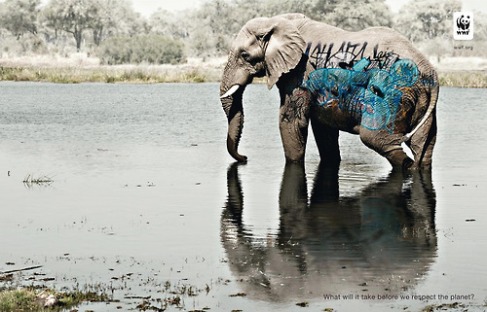
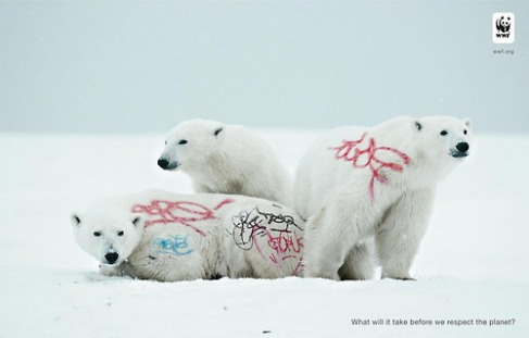
Haunting campaign for WWF, by photoshopping graffiti (something we are used to seeing in cities, towns and even villages) onto animals that are intrinsically wild and free demonstrates a metaphor for the destruction and degradation of humanity on the planet. Having been to Zambia last summer and Tanzania the summer before and going on safari on both, I was struck by how wild and brutal the wilderness can be. 
On one particular instance, we were out in the bush with our driver when we got too close to an elephant and it spooked and started to advance on our jeep, swinging its trunk in a menacing manner, until our driver revved the engine to scare it off. 
If anyone has seen Gordon Buchanan’s BBC documentary ‘The Polar Bear Family and Me’, then you will have seen the perspex cage in which he filmed from be attacked by a hungry female for 40 minutes. 

In conclusion these are not peaceful or friendly creatures.

The beauty of this campaign is that Ogilvy have turned this around and placed something that we see as damaging (graffiti) on top of these creatures, showing them as vulnerable and prompting us to look at the images and think ‘what a shame’ and ‘how could we let this happen?

Image

ImageImageImage

 JCDB x

Going Gone Gorilla

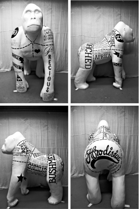
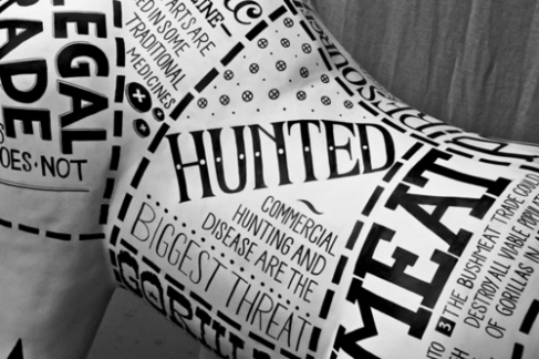
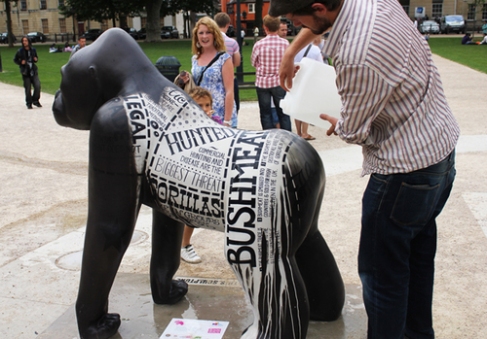
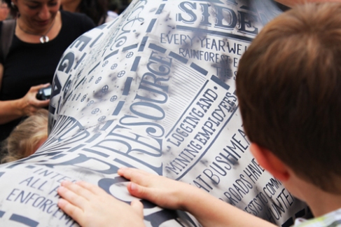
So I love pieces that can be used as an interactive yet striking piece and these gorillas, by creative agency 365, fit the bill. Created for Bristol Zoo’s 175th birthday, sixty sculptures were erected and Ged Palmer (http://gedpalmer.com) was commissioned to design hand-drawn typography to cover the gorillas, producing a striking visual but also explaining the plight of these creatures in relation to their being hunted for bushmeat in Africa.

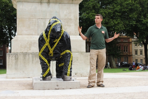
Located in Bristol city centre, the sculptures were initially covered in a heat-sensitive black paint which the agency poured a set amount of hot water over, to start off the interactive event. Observers could then use their body heat to reveal the rest of the lettering on the sculpture.

ImageImageImageImageImageImage

JCDB x

‘What happens to lovers while they are sleeping?’

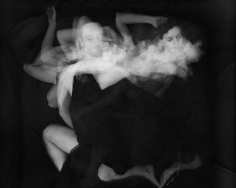
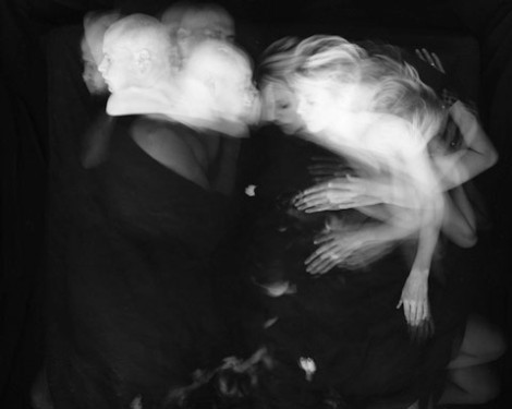
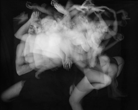
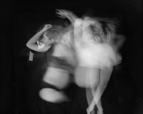
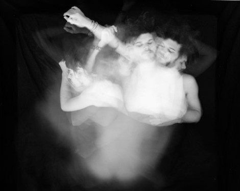
Paul Schneggenburger, a German photographer, has used this question as a basis for this project, he wonders “Is it a sleeping just next to each other, each on his own, or is there a sharing of certain places or emotions? Is it a nocturnal lovers’ dance, maybe a kind of unaware performed tenderness, or does one turn their back on each other?”

This series of photos, The Sleep of the Beloved, he uses long exposure photography to photograph sleeping couples between midnight and 6am. These are hauntingly beautiful, intimate, almost fairytale-like in their soft qualities; although I’m no photography expert (I love taking photos but haven’t investigated going much further playing around a bit on Photoshop), I can appreciate the beauty and romance of this concept and will definitely be checking out his website at http://www.schneggenburger.at.

ImageImageImageImageImage

JCDB x