3Doodler experiments

Post-graduation and job hunting is wearing me down, so what better than a little creative experimentation with my new 3Doodler!?

In case you don’t already know, the 3Doodler is ‘the world’s first and best 3D printing pen that allows you to draw in 3D’ (the3doodler.com). It uses plastic filament which heats as it travels through the core of the pen and cools almost instantly as it leaves the nozzle, allowing you to bring your doodles to life.

The video for this pen is super exciting and also, I soon discovered, totally unrealistic for the beginner… I was tempted to leave this out as my doodles are significantly inferior, but it’s interesting to see the potential in such an innovative tool:

SO, how to even begin… the video makes 3Doodling look incredibly easy (it’s not). In the same way that you learn how to use a new piece of technology, practice makes perfect; for example, here are my first few attempts:

start

Not exactly groundbreaking.

I decided to start on a simple project; before I started to try and create masterpieces like the Eiffel Tower, I decided to stick with what I know and create the alphabet… using the slow speed on the pen of course. This wasn’t a hugely long project, I’ve just spent an hour or so experimenting, so it’s more practicing and getting used to how the pen works, but there were several interesting things about the final letters.

I used a plastic wallet as a base as this seems to be what the heated plastic works on best, but it also meant that it welded slightly to the plastic which meant it bent slightly as it was pulled away, creating interesting shadows when the letter is then placed on a flat surface. Also the ends of the letters aren’t clean cut, the plastic thins out as the pen is pulled away. This was the result:

(More photos/ experiments to come soon!)

The Chain Reaction Project

If you know me you’ll know that I have a bit of a soft spot for good charity design (see Coca Cola Cough Medicine) and I came across this project, by Singapore based branding agency, Bravo Company.

The Chain Reaction Project is a non-profit organisation, launched in 2009 by a group of women who were committed to transforming lives in some of the world’s poorest nations. Their mission is ‘to find a cause and have an effect and, from there, grow their initiative by inspiring others to be catalysts for change as well’.

1469921457R5Xk

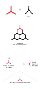
For the design, Bravo Company have chosen to go down a simplistic but effective route, utilising simple lines and a two-tone colour palette. The identity is restrained yet accessible through the use of rounded terminals and a similar sans serif typeface; the overall impression is a blend of playful and technological undertones, implied by a light and consistent line weight throughout the branding.

The logo mark is based on the Chinese character ‘ren’ meaning ‘people’; it represents the company’s namesake through three points branching out from one – a concept that is pushed further in the use of the identity as a basis for a larger network of assets. Hexagonal forms are created when the logo mark is repeated and combined, creating a visual chain reaction but also referencing hives and communities – a visual representation of the brand values.

14699214574zqu

The identity integrates seamlessly within a series of icons, one for each of the charity’s various causes, proving its flexibility and cementing it as an essential element of the brand mark.

14699214576Qx1

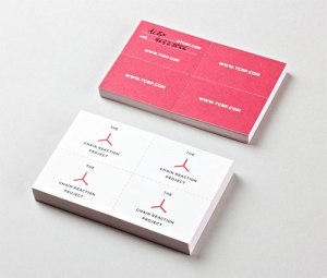
The Chain Reaction Project further embodies the concept of their namesake through their business card, which creates its own physical chain reaction. The business card is perforated, so the recipient keeps one and gives away the other three.

1469921457rLbD

The card they keep is complimented by handwritten details on the back, in the hope that this will encourage the recipient to feel individually responsible for their part in the bigger initiative.

1469921457wdNL

All of these design elements come together to form the branding for The Chain Reaction Project, using strict geometric angles and rigid designs which appear human and approachable through the softening of edges and rounded terminals.Described by Dr Jose Ramos Horta, Nobel Peace Prize Laureate, as ‘a bridge of solidarity and compassion that connects us as human beings’, the 3-stroke identity holds its own as a stable and brilliant brand story.

1469921457whk0

1469921457gsOT

Image source: The Chain Reaction Project

Face-to-screen time

The face of communication in the UK is changing. 71% of consumer phone users have a smartphone and the way in which we use them isn’t just changing the speed with which we can get in contact with people but also the way we interact with the real people face-to-face. Screen oblivion is an issue that interests psychologists, doctors, councils, police, parents and friends, and that’s just the start. Why such a diverse range of people? Because technology facilitated through the screen of a smartphone has infiltrated every corner of social interaction, especially among those deemed the ‘digital natives’.

death-of-con-2__880

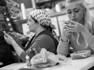
Smartphone use in society is a hot topic of conversation, not least when considering the safety of people using them in public. The subject of this post focuses around street photographer Babycakes Romero’s project entitled ‘the Death of Conversation’. Romero sees a beauty in the symmetry shown, if one person is on their phone, another is likely to be and the odd photo shows one person stood, gazing into space as if alone when in reality they are in the company of others. This demonstrates a certain sadness, these photos are not an unfamiliar sight in our society; in fact I’d challenge anyone to walk down a city street for ten minutes and not see this multiple times over. When people are alone, bored, feeling awkward or uncomfortable then they take their phone out of their pocket, unlock it and scroll through messages, social media, photographs… anything so they do not look like they are alone. People are so plugged in that they would rather look at a screen than the environment they are walking through, or the friend they are spending time with. They’ll pull their phone out to browse what their online friends have been up to when sat in front of their real friends. People sit in restaurants with their partners, but with their phone sat lying face up on the table next to them; they go on holiday to exotic places but waste valuable time checking what friends back home ate for lunch that day; parents alienate their children by prioritising a text and colleagues are too invested in what their Twitter feed tells them than building meaningful relationships with colleagues.

death-of-con-1__880

What does this mean for human relationships? We are spending time, the most valuable commodity we have, investing in other people’s screen-lives and false selves; a photo is worth a thousand words, but the smiles could be fake and plastered on to show people ‘what a good time they’re having’. The biggest problem lies in when we do this when around other people. Every person in Romano’s photographs has left the house to interact with people, yet most are choosing to interact with a screen instead of the person in front of them, their attention is in another place and the attitude given is that the person on their phone would rather be somewhere else. People are beginning to crave a release from technology and with little wonder when one can invite their friend to dinner yet still feel like they are dining alone.

death-of-con-3__880

I decided to spend a week tracking my own smartphone use, conscious that I probably spend more time on the device than I should. Although the results were interesting, it’s worth noting that they weren’t reflective of my total screen-time, as I also use a laptop and often an iPad throughout the day. I was still surprised at my results: On average I was spending 100 minutes a day on my phone, a solid hour and a half; the highest was 138 minutes and the lowest was 46. Predictably the busier I was the less I used my phone but it still seems like a crazy amount of time to be wasting looking at a screen the size of my hand. I also used another app to see how often I was checking my phone throughout the day; the lowest was 42 and the highest 96. I’ve also noticed that despite feeling uncomfortable about having apps ‘watching’ my phone use, I’ve started consciously noticing and using my phone less in social situations.

death-of-con-4__880

Interestingly there is a conflict about whether using your smartphone around others is ‘good’ or ‘bad’ manners. I’d argue that those who think it’s good manners are possibly more attached to their smartphone than to those with whom they are spending (screen)time with. It will be interesting to see whether there will be a shift in social etiquette that frowns upon phone use, especially that of browsing social networks, around other people unless absolutely necessary. There’s a huge amount of potential in the time you set aside to spend with people and it’s time to value face-to-face contact over face-to-screen.

death-of-con-6__880

death-of-con-7__880

death-of-con-8__880

death-of-con-12__880

Image source: http://www.boredpanda.com/the-death-of-conversation/

No Make Up Selfie: The Good, the Bad and the Ugly

This weekend I was nominated to do a no make-up selfie. For those of you who aren’t aware of this trend, it’s a social networking viral craze used to raise awareness and funds for cancer research. However for something so seemingly ‘good’, it has caused a huge amount of controversy.

No one seems to be sure where the trend started but one sure fact is that it wasn’t set up as a campaign by any cancer charity; some have said it may have been prompted by this (http://www.theguardian.com/books/2014/mar/11/laura-lippman-selfie-kim-novak-solidarity) while others say it was a reaction to the now-famous Oscars selfie led by Ellen De Generes.

Personally I wasn’t sure what I thought about it, I have seen people praising the trend and people slamming the trend so I thought it would be worth exploring a little before doing one myself. Initially all I thought was ‘not more selfies’, I’m not a fan of the posed, caked with make up photos I see every day and all this seemed to be (initially) was another way for a girl to fish for compliments on the way she looks without make up, while still wearing foundation and some not-so-subtle eyeliner. I’ve even seen ‘no make-up’ selfies of people wearing fake eyelashes which, forgive me if I’m wrong, completely defeats the point. The first round of pictures I saw didn’t even mention donating (that started to pick up after the first round of criticism), but then I noticed followers of the trend beginning to upload two photos, one of their bare face and one showing the text donation, slightly over-philanthropic perhaps but you can see why people would want to prove they had done their part after all the ‘why don’t you actually go and do something’ comments.

One criticism appears to be ‘what does not wearing make-up have to do with cancer’ and the answer is essentially nothing. As I mentioned previously, the trend was not a campaign devised by charity strategists or fundraising teams and therefore searching for a deep meaning within the trend won’t get you very far. Having said that, meaning could possibly be found; a cancer survivor (who doesn’t actually agree with the trend) offered this as a potential explanation:

“(No make-up selfies are a way of) baring yourself, exposing yourself, making you feel vulnerable, trying to understand a mere taste of the fragility that someone with cancer experiences when they look in the mirror”. 

The main criticism that I have seen appears to be people blindly saying that those who are posting no make up selfies are having no effect and not helping the cause. I would like to argue against this. I strongly believe that this trend has made a huge difference; cancer research charities have raised £2 MILLION in three days from a campaign that they didn’t even set up.  Even those who took part early in the craze and may not have donated have nominated others who may have donated. For example one person doesn’t donate, but nominates five others. The five she nominates donate £3 each and nominate five other people each, all of which donate. Even if the chain stopped there that’s £90 raised for cancer research! So even those who didn’t manage/didn’t want to donate have unconsciously raised money through those they have influenced to take part.

As for those even shorter sighted people who say this trend will do nothing to raise awareness – look how much controversy it’s caused. If I look down my Facebook timeline today I’m sure I’d come across at least five selfies and at least one person moaning about how it’s not making a difference. And I’d like to argue that those who moan about people doing the selfie and not donating – how many men do you moan at for not donating or being sponsored while doing Movember? A lot of men I know do it for fun, but because people notice something different it’s still raising awareness of a great cause and they are doing something rather than doing nothing. Even if you knew nothing about the trend, seeing a photo of a girl who you hardly recognise, due to the lack of make-up, is enough for you to stop and question why she’s uploaded that photo when she’s usually so image conscious. It is a trend that is only successful because of people’s vanity, if it was just a standard selfie than no-one would notice anything different; if a girl gets complimented on her ‘natural’ look in the process, where’s the negative in making her feel a bit better? As long as this is not the sole reason she posted it then I can’t even see that being a valid criticism. The whole concept of social media is built on people’s vanity in building their ‘online presence’ and showing themselves in the best possible light.

I agree that it’s a ‘lazy’ way to help but people have such busy lives that perhaps a quick photo and a £3 donation is just the easiest way to help out. How many of us would stop to talk to the fundraisers standing outside the tube station every day, listen to what they’re trying to raise awareness of and give them £3 towards their cause? Probably not very many. How many of those who criticise would go out of their way to buy that homeless man they walk past every day a breakfast and chat to him? These are other easy ways to give to charity but they are still ways that the majority of people don’t make time for. I think if you’re going to criticise the no make-up selfie trend, personally I’d like to see how you’re taking the time to do something better.

The whole ‘campaign’ goes to show the incredible power of social media, £2 million is an incredible achievement in such a short period of time. One professor of Communications said “this campaign has captured the imagination, very rapid communication like this has never been faster in human history”. It’s incredible that now we don’t have to go anywhere to do our bit, incredible that we can feel like part of a community in a fun task with our friends but also know that we are helping, even if it is in such a small way and at minimum personal cost to ourselves. At the end of the day combining popular trends with fundraising is a great way to reach young and untapped audiences.

This is a short-term fix for cancer charities. Cancer charities find it harder than not-for-profit organisations that are raising money for a specific cause at a specific time to organise mass fundraising drives and it’s something that arguably features so heavily in our day to day lives that we forget how important it is. This campaign shows us that fundraising doesn’t have to be something that is out of our reach as busy people, something that we can do with our friends and something that isn’t a chore. It’s raising money, it’s raising awareness and it’s showing support if nothing else. I’d like to remind everyone that the NekNominate drinking game craze was incredibly popular just a couple of months ago, it was only criticised by adults who were quick to condemn the binge drinking and irresponsibility and it led to three deaths; I have seen far more comments from my Facebook network condemning the no make-up selfie trend than condemning NekNominate so social networks, let’s get our priorities straight.

Text BEAT to 70099 to donate £3 to cancer research to help beat cancer

Snap happy

Last week three VIPs took a moment in the most important and publicised event in the world that day to capture their own image on a smartphone. Little did they know that this would become the most circulated and reproduced images from Nelson Mandela’s memorial and one which would spark debates on society, photography and what Michelle Obama thought of it all.

It’s a strong statement in our society when a smartphone is the resounding topic of such a momentous event and one which prompted the Guardian’s Stuart Jeffries to ask whether camera phones are killing photography.
(You can read his article here: http://www.theguardian.com/artanddesign/2013/dec/13/death-of-photography-camera-phones?commentpage=5)

Jeffries observes that smartphone photography encourages laziness, we don’t stop to consider the shot but are more concerned with capturing the moment than capturing unique angles, compositions and lighting for the perfect image. Smartphones are putting professional photographers out of business, in the same way that the rise of photography in the 1850s meant that many family portrait painters lost their livelihood.

The wave of popularity for smartphones holding ever more sophisticated cameras has meant that the value of a good photograph, let alone a printed one, has diminished and any old person on Instagram claims themselves to be a ‘photographer’. Photography can now be held alongside the fast fashion, throwaway culture that we live in – the mentality that if we take hundreds of photos in five minutes of an event, somewhere within them will be the one we intended to get… or close enough.

We have lost the little rituals in personal photography, such as considering a shot at an event because we only have 26 photos on a roll of film or waiting a week for photos to be developed. The equivalent of having a photo of our family in our purse is now having them as your iPhone background. Hundreds of photos will be forgotten or lost on hard drives and psychologists even argue that there is such a thing as a ‘photo taking impairment effect’, where the act of relying on a camera to record memories means that you subconsciously store the memory to a lesser extent than you would have otherwise. We are suffering experientially just for the sake of a phone full of photos.

It all seems a bit doom and gloom as far as photography’s concerned, but there’s a whole other side to the story. Despite the rise of platforms such as Instagram, a person with a smartphone is not qualified to call themselves a ‘photographer’ and more than a person who can doodle can call themselves Michaelangelo. There is definitely a blurring of the lines between personal and professional photography, but it’s far from being killed off.

Digital photography has brought photography to the masses; as with anything put into the mass market, the quality is bound to suffer, but that doesn’t mean that the craft of taking a ‘proper’ photograph is lost. Digital has taken away the expense of buying, developing and printing film and it allows people the potential to capture great images, even if they’re not the kind of images you’d want to be put in your wedding album.

It has often been said that ‘the best camera you have is the one you have with you’. Naturally a DSLR will always beat a smartphone camera but they are a huge effort to carry on your person at all times, whereas you’re more than likely (if you own one) to have your smartphone readily accessible in a pocket or bag. Yes, the process of photography has changed in terms of the everyday person but we, as human beings, often use our personal, less than professional photographs as a means to connection.

Social networking has allowed us to share with more people and over vast distances more than ever before, and it also allows us to share our photographs – there is often no photo limit and the platforms are usually free to use. We are encouraged by others and it’s often a shameless form of self-promotion with users plugging in to the rise of ‘hey, look what I’m doing/where I’ve been’ photography. Our society loves to be able to see things in our friends’ lives and be able to pass comment on them remotely, we’re often not too bothered about high-res images, excellent lighting or inspired composition.

In the 21st century as a culture, we are recording our own history in an unprecedented way. In September Facebook revealed that its users have uploaded more that 250 billion photos, and are uploading 350 MILLION NEW PHOTOS each day… That’s an average of 217 per person, per day. (http://www.businessinsider.com/facebook-350-million-photos-each-day-2013-9). It’s a momumental amount of data and proves how obsessed we are with documenting our daily lives, from what we have for breakfast to the oddly dressed person we saw on the tube.

We have an incredibly casual approach to taking photographs and a lot of them will be irrelevant to look back on in 20 years time but it’s still an interesting insight into daily lives, I’d rather see a picture of what someone had for dinner than read constant status updates where they tell me they’re bored/hungry/tired.

But I don’t believe that photography as an artform will die as long as there are those who want to learn the craft and consider photographic composition and lighting rather than just being concerned with just getting any photo that hints at the intended meaning. The landscape of photography is adapting and advancing with technology, but this is a natural step for progression. Fashion photographer, Nick Knight, champions the iPhone as a great tool in his photography and the iPhone Photography Awards show that not all smartphone users are taking endless photos of their cats.

Kim-Hanskamp1 Jon-Resnik Maegan-Moore Luyu-Huang

A selection of winning photographs from the iPhone Photography Awards 2013. (See more at https://www.ippawards.com/index.html)

Of course there is potential in smartphone photography, so long as the elements that are photographed are considered, but photography as a profession will still sit on a level higher. Personally I wouldn’t hire someone with an iPhone to take my wedding photos, no matter how qualified they may be, but perhaps we need to see this as an opportunity or a new path within photography rather than a disaster for the industry.

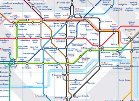
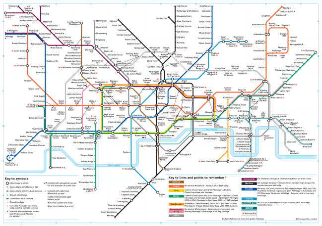
The Tube Map: a very British symbol of simplicity from complexity

Image

We’ve all seen it, I see it every day and stare, absent-minded, at it for roughly two hours as I travel to and from work on a variety of lines. To me it goes hand-in-hand with ‘please mind the gap’ and ‘stand clear of the doors’, but to a newcomer it is an aid to getting around the world’s second largest megacity.

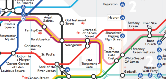
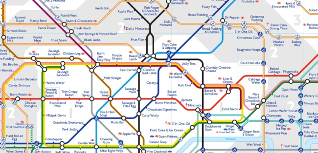
It has inspired other underground (or subway) maps the world over and has been parodied globally to give the lines new significance – from a Biblical tube map to what each tube station tastes like, put together by a man with synaesthesia.

Image

The Biblical Underground

Image


‘Tastes of the Underground’

It’s a map of London, albeit a non-geographically accurate one, which is symbolic of more than just train lines, but has become an icon of the capital and an inspirational piece of design. But why has it been so successful? How has it become this icon of our capital city and why is it so highly merchandised – why don’t we want iPhone cases and pillowcase covers with local bus routes printed on them?

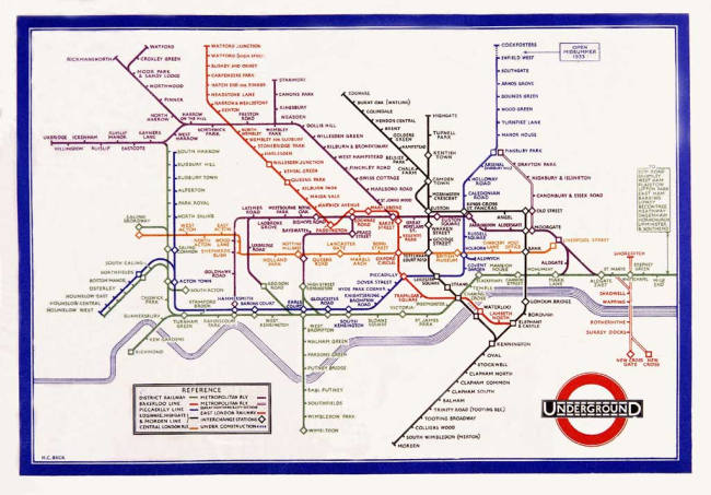
 In March 2013 the creator of the tube map, Harry Beck, was honoured with a blue plaque which commemorated the 80th anniversary of the map’s birth in the year of the 150th anniversary of the London Underground.

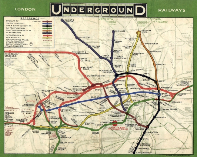
However, Harry Beck wasn’t a big-shot designer working for TfL, but was originally employed to draw electrical circuits for the Underground and, in his spare time, sketched out a diagram to replace the haphazard and complicated map that Londoners used at the time for want of something better

Image

The tube map before Beck

Image

Beck’s tube map

A map, by definition, is a representation of the features of an area of the earth, showing them in their respective forms, sizes and relationships. However the tube map, for all it’s simplicity and accessibility, is not geographically correct; as this is the premise for a map then there must be a deeper explanation as to the success of such a diagrammatic and geographically inefficient ‘map’.

Map designer, Aris Venetikidis, gives us a possible explanation as to why we have such a love for those inaccurate coloured lines. When we move to a new environment we start to build a cognitive map in our brains of where we are – as we spend longer in the environment, this map expands until, eventually, you know your way around. In order to do this, you construct linear routes linking point A to point B – our mind constructs these straight lines and generally a route coming off that first line will be at a 90 degree angle. We attach meanings and emotions to the things we find along these lines and fill our cognitive maps with markers of meaning. Imagine for a moment that you are drawing a quick map for a friend, you are likely to use straight lines and corners but it is highly unlikely that it would be a geographically correct representation if you laid an OS map over it.

Explaining this unlocks the secret to the success of Harry Beck’s map; although he didn’t realize it at the time, he was creating a map which correlated to the language of our brains and how we would create a simple map of our environment. Aris Venetikidis therefore attributes Beck’s success to three things:

  1. the omission of less important information
  2. extreme simplification
  3. extreme geographic distortions

(Aris’ TED talk can be seen in full at http://www.ted.com/talks/aris_venetikidis_making_sense_of_maps.html)

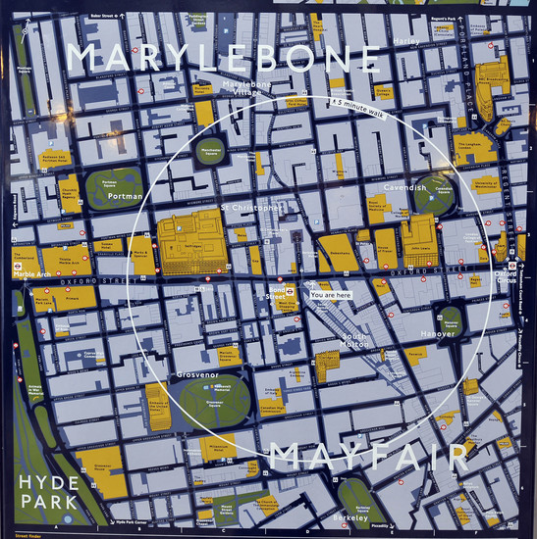
There are many who argue that geographic distortion is detrimental to both Londoners and tourists in terms of creating a sustainable way of getting to know your environment. The misrepresentation of the distances between stations causes confusion and unnecessary travel – for example between Covent Garden and Leicester Square which is a three minute walk. Another example is the route between Chancery Lane and Farringdon Station; on the tube this would require two changes and four stations yet it is a seven minute walk between the two.  

Image

The ‘Walk Map’

‘Legible London’ is a system which encourages and helps those in the capital to find their way around by walking. They describe themselves as ‘giving people the confidence to get lost’ (Patricia Brown, Chief Executive of the Central London Partnership) and make the point that ‘109 journeys between Central London Underground stations are actually quicker on foot than the Tube’ (http://www.tfl.gov.uk/microsites/legible-london/3.aspx). With this in mind the Central London Partnership created a visual language and consistent mapping system which encourages people to walk around London and to remedy the fact that Beck’s tube map may have skewed people’s perceptions of where things are. The CLP also developed terminology which tapped into the phychological idea of cognitive mapping in order to implement their scheme. During research they identified specific areas of London which they termed as ‘villages’; these were areas such as Leicester Square, Covent Garden and Knightsbridge, areas with commonly used names which can help pedestrians to quickly relate one part of London to another. Within these villages they further identified ‘neighbourhoods’, for example within Covent Garden lie the neighbourhoods of Seven Dials, Neals Yard and Long Acre, with the intention that as the pedestrian becomes more familiar with the area, the more they will subdivide it into smaller, linked pieces, building a more detailed mental map.

Image

Legible London

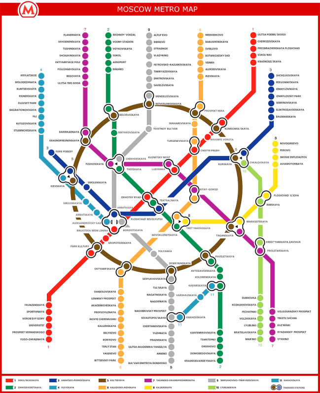
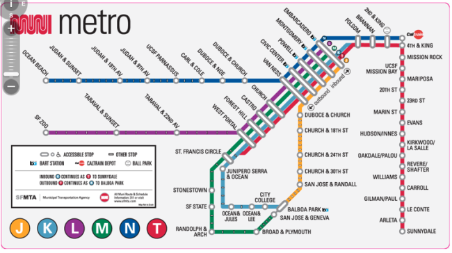
Despite the drive for people to really get to know their surroundings and walk around the city rather than use public transport, Beck’s tube map remains an iconic design which is immediately recogisable globally and has visibly influenced other transit designs, for example the Moscow and San Francisco subway maps

Image

Moscow’s diagrammatic subway system

Image


San Francisco’s subway system

Beck’s design is an extreme simplification of an overcluttered system which has made navigating the warren of the underground possible both for Londoners and newcomers to the city. The oversimplification prompts the language of wayfinding in the brain and explains that virtually all perception is about simplification, omission and compression; The success of a non-geographically correct map such as Beck’s is that the mental map we build is not strictly geographic but revolves around the relationship between relevant and memorable locations and routes between them.

#RoyalBaby

The Royal Baby, the Prince of Cambridge, Kate and William’s son, the future King… this child has been given more names (and had more photos taken of him) in the first 24 hours of his life than any other baby in modern times – before finally being named George. No-one is indifferent to the birth of our future Monarch, whether you are a fan of the royals or not.

It’s estimated that Prince George of Cambridge will boost our economy by prompting $240 MILLION on spending – this is broken down into these estimated figures: £87 million on celebrations and party supplies, £80 million on merchandise and £76 million on media including books, DVDs, magazines, and newspapers. (http://www.huffingtonpost.co.uk/2013/07/23/royal-baby-economy-boost_n_3638066.html?utm_hp_ref=uk).

A huge amount of that spending is on merchandise but what kind of merchandise has this landmark birth actually prompted? Is this design that will last through the decades and truly represent the significance of this great occasion for Great Britain? Most probably not if you’ve seen any of it.

So have a peruse over the crème de la crème of Royal Baby memorabilia and decide for yourself whether you’ll be contributing to that £80 million figure or sticking with a trusty bottle of champagne.

Image

How about a Lego version of the couple? Created by a couple who are renowned for their bespoke designs, this isn’t the worst idea in the world but would you pay £30 just for two and a half tiny figurines?

Image

Scoot over to eBay and you’ll find homemade versions of the couple plus Great Granny, slightly more special given the handmade element but still not sure where you’d put them.

Image

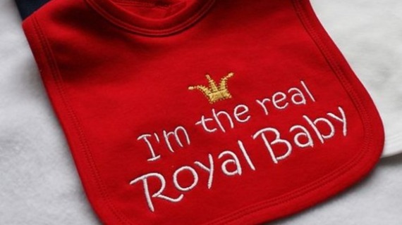
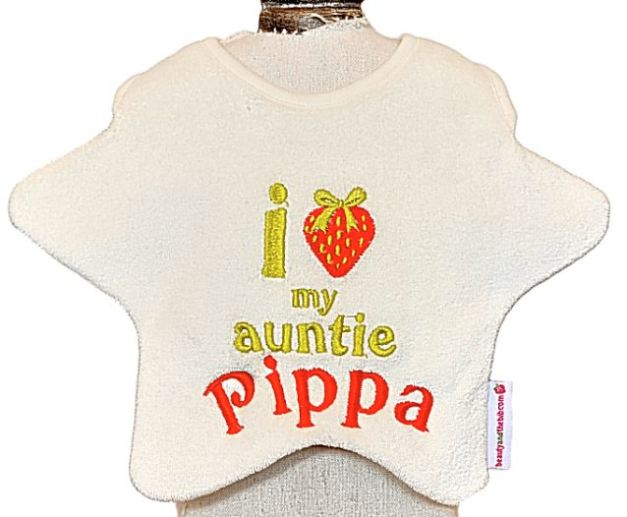
And if you’d like to pretend that your own newborn is actually the heir to the British throne then there are a multitude of products to choose from, not least of which is this dummy above. Personally if I had a child I’d want them to grow up with their own identity intact. See more wannabe Royal Baby products below.

ImageImage

Image

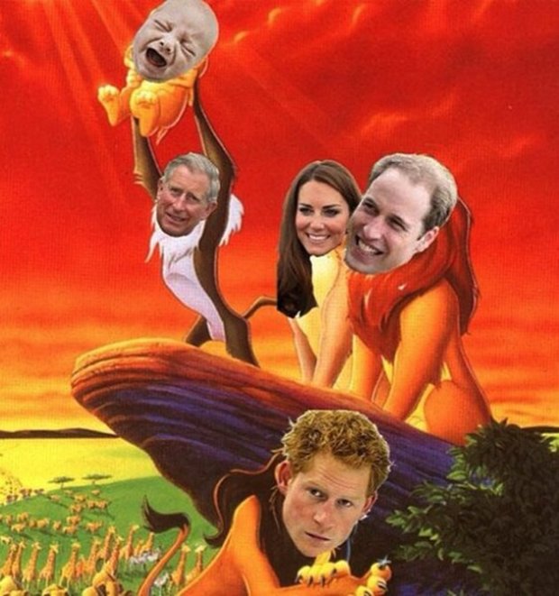
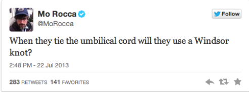
Aside from all this, the Royal birth has prompted some more entertaining responses from the world of social media, most notably this, which has been doing the rounds on Tumblr.

Image

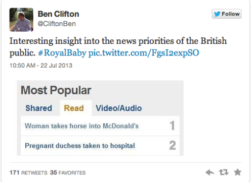
And Twitter spoke of little else with Royal baby mentions reaching 25,000 tweets per minute post-birth announcement; whereas the #royalbaby has been used 900,000 times (this figure is still rising). Some Tweets were serious, some not so… here are a few of the latter for your entertainment.

ImageImageImageImage

And finally… COME ON Britain, really?!

Image

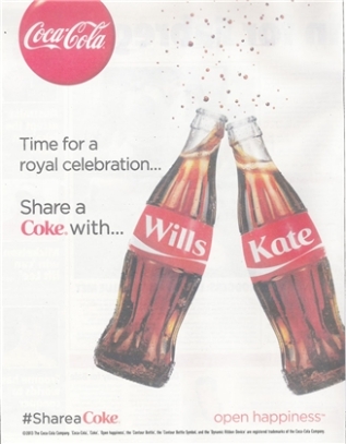
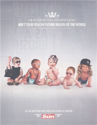
In other news, brands churned out some clever copy as fast as possible to make their ads culturally relevant for the day:

ImageImageImageImage

But it hasn’t all been as tacky as (some of) these; we live in an age where the birth of a VIP has been saved from every possible angle in HD, thousands of articles have been published and will be forever available online at the click of a mouse and praise has come in thick and fast for the Royal couple who have shown from their behaviour that royalty doesn’t have to be a thousand miles from real life. So congratulations to Wills and Kate and welcome to Prince George!

Coca Cola cough medicine

Well… almost. It’s been a hot and stuffy Friday afternoon in the office and I’m finding myself trying to find inspiration in clever design when I came across this innovative idea by a charity called ColaLife.

 ColaLife works in developing countries to ‘bring Coca Cola, its bottles and other together to save children’s lives by opening the distribution channels which Coca Cola uses to enable ‘social products’ such as oral rehydration salts and zinc supplements to use similar routes’ (http://www.colalife.org/about/)

This began with the concept of using space in Coca Cola crates transported around developing regions, this is currently being trialled in Zambia. In case you aren’t aware, in some countries it is common practice for Coca Cola and other bottled drinks (for which we, in the UK, would expect plastic bottles) to be sold in glass bottles which are then recollected by the seller and sent back to the company to be refilled. This earns the seller extra money (they get paid a small amount for each bottle that they return), eliminates waste material and means that Coca Cola spend a lot less on material.

On a recent trip to Tanzania I noticed this trend and was impressed with how resourceful the locals were with the materials that they could get their hands on. There is no throwing half a bottle in your bag for later or reusing it personally as a water bottle for a few days, plus there is something about drinking from a glass bottle that is (dare I say it) a bit classier. Having said that, I’m not sure drinking from a glass bottle while building a toilet for the local village can be called classy…

Image 

Going back to ColaLife, they have noticed a gap in the market and a need that needs to be addressed. As a charity they have worked with a current service at no inconvenience to what is already in place. ColaLife realised that Coca Cola is something that is available virtually anywhere in the world but in developing countries there are areas where one in nine children die before their fifth birthday from preventable diseases like dehydration or diarrhoea. This is a heartbreaking statistic when you consider that this is sixteen times the average for developing countries where the same statistic stands at 1 in 152.

One girl I met when I was travelling was called Joy, she was a part of the village that we were building in and she was clearly very ill. While we were in the village she was extremely shy – we would be playing with the other children and she would join in when everyone else did but she would never be the first to run to catch the bubbles or chase after the ball. After a couple of days we gained her trust and she liked nothing more than to sit on our laps and watch what was going on. On one of the days we went to the village there was a change, she was quieter and kept falling asleep… it was horrible to know that we had food in our backpacks and clean water but couldn’t give it to them (under orders from our team leaders and the fact that we couldn’t give everyone something) but eventually our team leader came and took a look at her and told us she was very dehydrated so he subtley took her parents aside and gave them a bit of food and some clean water to give to her away from everyone else. It is heartbreaking to know that now, two years later, she or someone she knows may have died from such a simple, preventable problem.

Image 

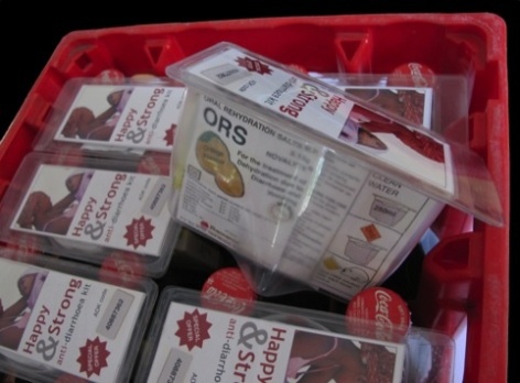
So ColaLife have developed this system, see the photo below to see how exactly their products fit in with the Coca Cola bottle system that is already in place. 

 Image

The AidPod (as it’s known) fits between the necks of the bottles and utilises the unused space in the crate to take vital aid to areas where Coca-Cola is a commodity (now most places)

As well as carrying some simple but potentially life-saving products, the AidPod has other features. First and foremost it is a container for the products shown below but it also acts as a measure for the water needed to take the medicine and a cup for future use.

Image

So all in all this is an incredibly well thought through and resourceful product for use in a culture in which aid is often difficult to distribute. It has often been said that to get aid out into a community that isn’t ‘westernised’, we have to be sensitive to how their culture works – throwing medicines at them won’t work but integrating them into an already seamless system and making the most of the free (well, perhaps it’s not free but it won’t be super expensive) transportation and distribution systems that Coca Cola already has in place.

This really is a truly inspirational product and while I’m sat at my desk designing leaflets/posters/brochures etc I can’t help wondering whether we, as designers, could lend a little of our time to thinking about how we can help those who aren’t in our immediate environment. We hear about poverty all the time, and I’m not blind to the fact that there is poverty to an extent within the UK, but the fact that one in nine children are dying from something that could be fixed with an AidPod fitted inbetween bottles distributed by a global brand? That’s something the designers within ColaLife should be insanely proud of.

Excuse me, can you read this for me?

It’s been a while since my last post and unfortunately I don’t have an original or exciting reason, I can only blame deadlines and exam revision, however as the last week of Uni for this year approaches I’ve decided I can treat myself to some productive procrastination in the form of blogging.

It’s your second year of Uni and you’re starting to realise that the work you do is really starting to count for something, it’s taken a while but finally you’re realising that every little bit of feedback from your tutor could make the difference between that all important first or 2:1 (depending on your own personal aim of course). It’s unbelievably infuriating to be given written feedback on your work and not being able to read it? As creatives we all know how easy it is to become blind to our mistakes after working on a brief for too long, even if it’s just a few spelling mistakes, and that’s where feedback from others becomes so useful.

While trying to distract myself from impending deadlines and exams I’ve spent quite a bit of time on Behance and design blogs and noticing a lot of typographic projects. The ones that are sticking out to me at the moment are those handwritten ones and I started to think about why this was the case.

Technology has stolen our preference and ability to write by hand, it’s something that should become habit and natural and say something about our personality. As designers we may be transmitting our personalities through online portfolio websites, twitter accounts and emails but I think an interesting handwriting style should be held as just as important for portraying our personality. 

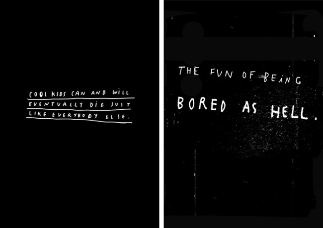
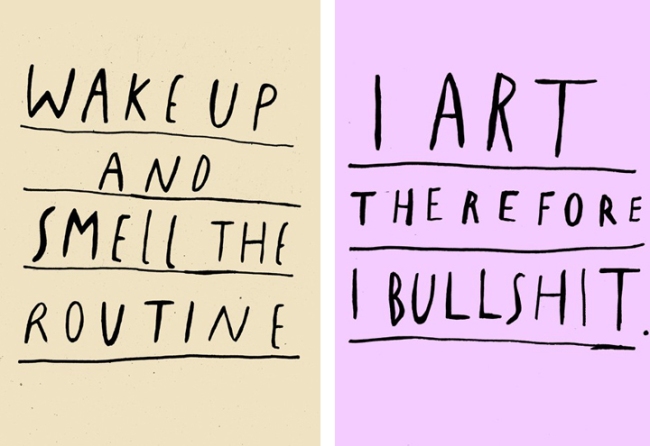
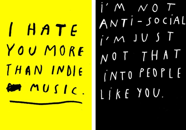
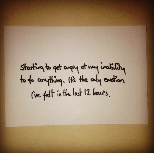
One particular project I came across was by a graphic designer, illustrator and creative named Wasted Rita based in Portugal, she jots down frank statements about life, work and reality, she plays with words to note brutally honest statements, mainly in her handwriting. 

Image

Image

Image

Image

Whether or not you like her handwriting or not, the humanist element of this ‘handmade typeface’ gives the statements much more emotion than if they were presented in Helvetica or even in a script typeface that has been used hundreds of times before. In fact people can even be specialists in the art of graphology, otherwise known as the analysis of handwriting to reveal character traits. But if we continue to use handwriting as a rarely used backup when our technology cannot do the job for us then graphology will become a thing of the past.

There is some debate over whether graphology is accurate, most would describe it as a pseudoscience; only one study has found a correlation between personality and handwriting styles. However it is possibly to predict the gender of a writer from their handwriting more often than chance could account for (according to linguistics expert Marisa Brook) and also hints that some hand preferences and neurological disorders could be linked, but psychological studies indicate that nothing else can be reliably determined from handwriting.

So graphology might not be a scientific science, the amount of times I changed my handwriting over the years clearly doesn’t mean my personality traits have changed. It’s funny how many people seem surprised by the fact that I can string a legible sentence together on paper, just because I’m a designer.

A few years ago I did a project where I handed out handwritten scraps of paper with a phone number on saying ‘tell me something I don’t already know’. The aim was to see how much information I could get from people by using the cloak of anonymity and one person commented on my handwriting: ‘You write nice, please write more, filled with grace and rhythm to the core’… a little unnerving but they later texted asking whether I was the doctor type, as my handwriting seemed that way. Interesting seeing as my father is a doctor and his handwriting’s awful…

Another example of handwriting used in creative projects is in this project, an experiment into the effects of sleep deprivation by a student at the University of Leeds, ‘documenting is decline into emptiness’. You can see his progress and judge whether you think his handwriting adds anything to the project, go to http://thexvoid.tumblr.com.

Image

So here’s a challenge to anyone reading this: use your handwriting more often, create an interesting and unique style… you may not use it all the time but people will notice it more than you would think. When was the last time you received a handwritten letter? When was the last time you wrote one? Would you rather receive a birthday email or a birthday card that’s actually been written in? Pick up a pen and see if you can make something interesting and unique out of that skill you haven’t thought about since high school.

How to create Jon Steel’s ‘Perfect Pitch’

I’ve been reading ‘Perfect Pitch’, by WPP’s Jon Steel, and it’s prompted me to think about what it really means to give a good presentation, something that, so far, I haven’t thought about in too much detail.

Image

This book was recommended to me by Peter Dart, of WPP fame, and Dave Brown, worldwide VP of Consumer Branding for the Brand Union; I was interested by the idea of the book but didn’t know whether the information would be relevant to me at the stage of my education/career that I am at (second year Graphic Design student, looking for placements for a year in Industry next year). I used to think advertising was where I wanted to be, partly because it was the only area I knew a lot about while doing Graphic Design at A-Level; since coming to University I have realised that my strengths and my preferences lean towards branding and working to establish the identities that become household names. However I thought Jon Steel’s book would give me an interesting insight into presenting to clients, a process that I haven’t had much formal experience in.

Although the focus of ‘Perfect Pitch’ is presenting, I think there’s a lot that can be applicable to our working process as designers and that we can learn from. In particular, Steel describes the five steps that he believes are essential to planning a good pitch.

1. Grazing

This is the research stage of any project, whether for presentation or for work on a brief, the collation of ideas and the ‘gathering of raw materials’ which seems obvious but as Steel mentions and as I have observed myself, many people will attempt to find a solution from the work go.

When I started my degree, having done two years of Graphics AS/A-Level at school and then specialising at Foundation level, I was used to the idea that you never settle on the first idea that you have, it was habit rather than something I consciously thought about. When our first project was group-work and I was coupled with people who came up with an idea seemingly out of nowhere and were happy to settle on it, I was surprised that I had to explain that the first idea was never backed up by enough evidence to be a final solution.

Steel mentions what he refers to as ‘the Data Dump’; this is when presenters throw a lot of unprocessed information at their audience without refining it, he uses O.J. Simpson’s trial as an example. Marcia Clark and her team were working to prove Simpson’s guilt and, in doing so, presented a large amount of complicated, scientific information that proved that Simpson’s DNA had been found on a glove at the scene. The information that she gave them was relevant but not refined to the point where it wouldn’t bore or confuse the audience and this was one of her big mistakes. In his book ‘Presenting to Win’ Jerry Weissman states that a Data Dump is ‘vital to the success of any presentation. The secret is that the Data Dump must be part of your preparation, not the presentation’. Weissman makes an excellent point that you do not need to mention every snippet of research in your presentation, rather work towards finding key insights within these vast areas of research so as to keep it concise.

Every week, for one of my modules, we have a three hour feedback session. We are separated into groups of eight or so with a tutor and given the opportunity to present what we have found or done during the week. Although not a formal presentation it’s interesting to see those who have planned how they will explain their research and those who simply go through piles and piles of articles and books, detailing every sentence or image that’s of interest to their brief. These are the people who need to read ‘Perfect Pitch’. I think it’s important that, even in a casual scenario, your research is presented well so as not to bore the audience, after all they are the people you will be relying on for feedback!

2. Looking for meaning

This is the part where you gather together what you have so far and try to make connections within it, which may lead to further research, insights and eventually the solution. Steel puts emphasis on the practice of moving points around (his preferred method is to use post-it notes) and pair them with points with which there is not an obvious connection, this is the way that the most original connections can be made and unique insights formed.

A few months ago I was working on a brief which asked me to promote the general population to live more sustainably. Obviously sustainability is a huge subject area and I initially didn’t know where to begin or how to narrow down my research; when I eventually settled on the disposal of objects that have lost commercial value, I conducted an interview with Dr. Julian Allwood, author of ‘Sustainable Materials, With Both Eyes Open’ and he encouraged me to look for the co-benefits – those that didn’t necessarily relate to the stereotypical view – of recycling. This led to much more unique insights and solutions than going for the points that fit together at first glance.

3. Drop It

I’m glad this was a part of Steel’s list as it is the perfect excuse for procrastination. I’m sure I’m not the only designer who gets creative block and has to completely detach themselves from their work every now and again in order to find their direction again. Steel says that they key is not to forget the project but to ‘put the whole exasperating problem as far from your conscious mind as possible’ in order to let it simmer. Steel mentions those who keep a notepad by their bed (something I have tried and not enjoyed, bed is not a workplace) but I prefer a more active approach. Everyone has their own form of ‘creative procrastination’ and mine is exercise; however much a project is stressing you out, working it out gets you out of the house (or office), clears your head and gives you an often much needed endorphin boost. Sometimes you won’t even realise that you’re thinking about the project – once on a night out I came up with a really strange idea (completely unrelated to events of the evening) which ended up becoming the conceptual solution to a book cover (this can be seen at http://jenny-cook.co.uk/117397/1122970/gallery/folk-tales-for-the-ever-curious). So the ‘creative procrastination’ does work!

4. Adapt & Distill

Back to business, this stage does involve going back to your workstation and narrowing it down to more specific presentation points. It involves sharing your idea with those who haven’t worked on the project to see if it makes sense (there’s a major conflict of interests if you try to establish this yourself), as Steel says ‘it’s not what you say that counts, it’s what other people hear’.

The reason for this stage is that you need to be able to cut the project down if needs be, for example if time runs short and you need to get all your main points across in five minutes.

Steel uses his part in a presentation to Unilever, for Persil’s ‘Dirt is Good’ campaign, as an example; this follows creative writer Robert McKee’s description of a story as a ‘design in five parts’:

  1. Inciting incident – the power of the concept which is based on real-life truth and blurs the line between what is good and bad.
  2. Progressive Complications – this is the problem, that parents agree with the concept on an intellectual level but still see it as a hassle when their children come home dirty.
  3. Crisis – an even bigger problem, this involved encouraging parents to play with their children.
  4. Climax – a ‘catalyst for change’, encouraging the ‘crisis’ problem to be solved through the childrens’ conversation with their parents.
  5. Resolution – the confirmation that the idea works through effects seen elsewhere in the world.

With a presentation broken down like this, it was presented in forty minutes but could have been delivered in 5 with all the main points put across.

5. Writing the presentation

Up to this point in the chapter Steel has not mentioned the use of a computer, and he definitely has not mentioned his arch-nemesis – the power-point presentation. This is an interesting point as during our weekly feedback sessions, we are often asked to put together a power-point or multiple page PDF to illustrate the ideas we’ve had so far… whereas Steel says putting slides together too early is ‘putting the cart before the horse’ and that ‘what you say, and what they see and hear should not be the same’. Basically do not read from the slides, this is boring and unoriginal; slides should be there to illustrate not as a step-by-step guide.

Interestingly I have a lecturer who is very good at not reading from the slides, to the point where if you daydream for five minutes of the lecture you will have completely lost the point that he was making, so abstract are some of the images he uses to illustrate. This is, however, a clever way on his part of ensuring concentration (for those who want to pass the module anyway) for his whole presentation every week. He likes to point out that the slides are of very little use on their own without his dialogue,  which is the point that Steel is trying to get across – slides are illustrations not the full story.

It’s interesting that we are not taught the specifics of how to present. At infant and primary school I was the girl whose report cards would state: ‘Jenny needs to put her hand up more’ or ‘Jenny is too quiet in lessons’, at some point in high school I outgrew this to take part in a public speaking competition, in which getting through the first round was a major achievement for me. On Foundation we were given the opportunity to present to our small group (of friends) but there were a few who would be missing on every ‘presentation day’. Now I feel that I could present a project adequately but not amazingly and, although at University we are told regularly that our presenting skills are not up to scratch, we are given little in the way of guidance. Steel’s book has highlighted a skill that I could definitely use some improvement on, but I do think Universities and higher education could provide more support for those for whom presenting will be key in their future careers!

Jon Steel has been in the advertising business since 1984, working as the agency’s youngest Brand Director for BMP and helped to make Goodby, Berlin & Silverstein, an agency in San Francisco, go from a fledgling agency to National Agency of the Year. He has worked for Sir Martin Sorrell at WPP and spent a year as vice-chairman of Berlin Cameron United in New York before returning to WPP in London. 

Image source: http://jigsawresearch.com.au/blog/?p=1286